Over the course of the Public Health Innovation Grant Program, PHAB Center for Innovation will feature updates from chosen grantees on their mission to develop, test, and implement innovative practices in the public health field. To follow-up on our August blog, How To Bring Design Thinking to Public Health, we hear from the University of Chicago team about how they are using design thinking in public health.
Academics would like to see their research make a broader impact on the world. And public health departments can use help making sense of their data and new technology applications. But as soon as academic jargon about data and analysis enters the public sphere, there is an obvious need to translate this jargon in a clear understandable way to the general public.
Enter, designers. Designers are not just experts in fonts, logos, and branding, they are much more. They are capable of explaining design processes of service delivery, data collection or websites. Their expertise lies in being able to communicate complex systems and content in a concise and beautiful way that appeals to broader audiences. One of the key contributions of design thinking is to ground these processes in the needs of end users.
Researchers at the University of Chicago’s Center for Spatial Data Science and School of Social Service Administration needed the help of designers for a project funded by PHAB Center for Innovation. This project analyzes data to identify where government funding for health services is spent in relation to need, and where it could be spent to decrease gaps in service access.
At a design sprint weekend in Chicago, pertaining to this project, a team of four experienced designers mentored 20 students from the School of the Art Institute of Chicago and the University of Chicago.
Students and mentors were split into three teams to develop alternative user experiences and web interfaces for presenting analytic results and for outlining the flow of public funding to nonprofit providers of health and human services.
Their main objectives were to:
- Synchronize the researchers’ analysis plan with the health officials’ needs.
- Understand the health department’s concerns about analyzing contracts data.
- Visually represent how money flows through the system and which data is collected or not.
- Translate statistical results into answers that stakeholders find intuitive and useful.
The students tackled the design sprint by reviewing the project overview the researchers provided, and spending two hours interviewing end users from the Chicago Department of Public Health. After two days of intensive work, the students gave final presentations and gathered feedback from end users.
The intensive discussion with end users, combined with working through process and product questions in detail, resulted in a synchronization of research plans and end user needs that promises to be more successful than the original research plan.
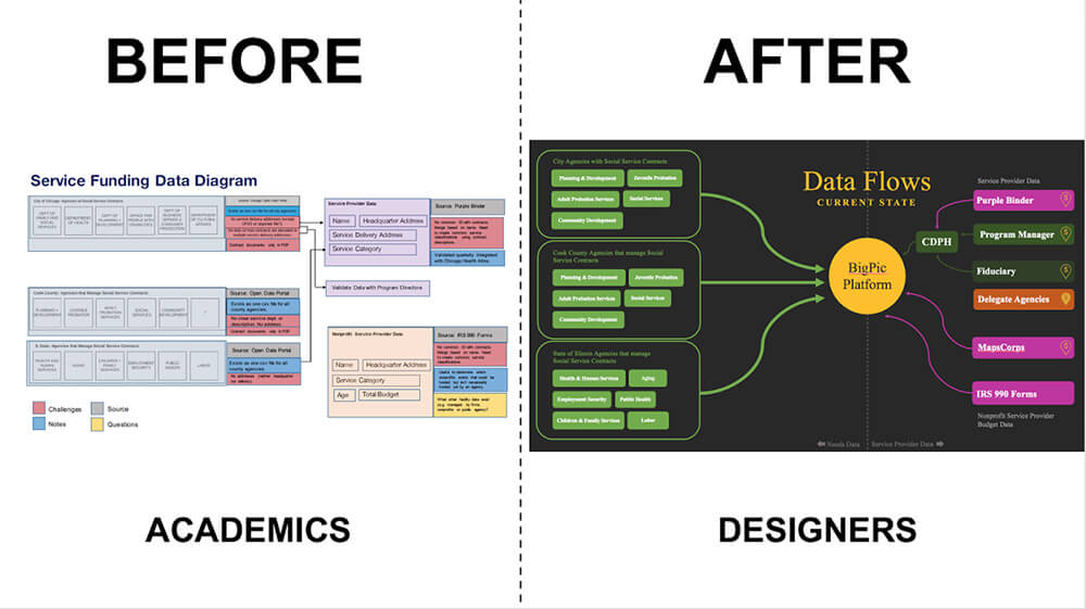
As pictured below, the designers improved the academics’ graphics through a more engaging and attractive solution that makes it easier to understand which data are collected within an agency, what data are still missing to answer larger questions, and how these data gaps could be addressed.

Example of Contract Data Flow Diagram before and after the Design Sprint
Click here to see the full process and results of the design sprint.


